![]()
![]()
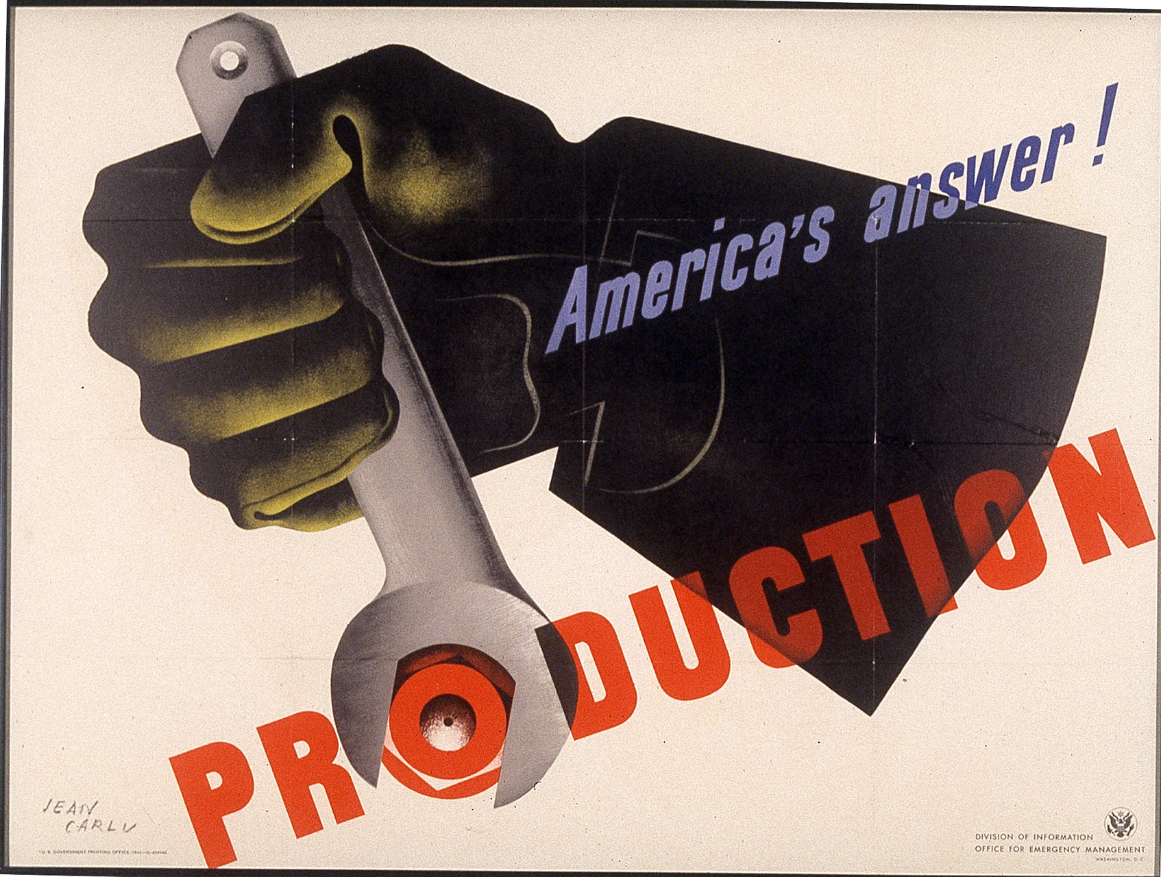
"America's Answer! PRODUCTION" The text is bold and direct. The gauntlet clad hand, in a power grip, is applying torque to the bolt, an element of "production" itself. These images bespeak power and action. The poster was designed to catalyze American workers to redouble their efforts to defeat the Axis (Germany, Japan and Italy) through the power of their labor. The Lend Lease Act of 1941 already had demonstrated the power of production in providing the Allies, such as Britain, with the material means to defend themselves against all-out Nazi attack. Throughout 1942 the Axis achieved military successes that stunned the Allies and became the impetus for action. The United States was mobilizing its own military through a massive draft of young men. Women soon would replace them in skilled production jobs. All manufacturing was put on a war basis, including military uniform buttons produced by the Rochester Button Company at 300 State Street. The poster was prescient. The key to Allied success in World War II was industrial production. On one hand, we may admire Jean Carlu's poster simply for the power of its image. On the other, full appreciation depends on exploring its historical and cultural contexts.
Paul Grebinger
Professor
Department of Sociology/Anthropology
College of Liberal Arts
The poster proclaims "America's Answer! PRODUCTION". And, I think "America's Answer! WOMEN". As in previous wars, the women of America served their country in a variety of capacities from the maintenance of family farms to the making of munitions in factories in direct support of the war effort. As the men went off to war, women went off to the factory to fill jobs once only occupied by men. They completed these jobs with efficiency and competency. The gloved hand depicted in the poster is an image of strength and capability. The strength and capability displayed by women as they worked to produce the necessary goods and supplies that would assure an Allied victory. The work women completed to aid in the war effort was commended by all in America. However, when men returned from the war, they went back to the factories and women went back to the home. It was considered permissible for women to hold jobs in steel mills and automobile factories in wartime, but peacetime called for a return to traditional roles. The rigid categories of work defined by gender lines remained unchanged after the war. Although present day America allows far more opportunities for women, we still struggle with gender equity. Jean Carlu's powerful image, however, helps us to remember that just as in wartime our vitality depends upon the equitable participation and treatment of both men and women in the workforce.
Pamela A. Viggiani
Assistant Professor
Department of Social Work
College of Liberal Arts
This poster creates a message without formal linguistic structure. Its visual clues vaguely replicates the colors of the American flag and a series of lines and geometric shapes creates an image of a hand cranking a wrench to fasten a bolt. Jean Carlu, through his symbolic language consisting of color, line, and content, depicts a message by juxtaposing art and written text. He conveys the message that labor is the "answer" to America's need for supplies during the war effort in 1942. The rhetoric of the poster hopes to persuade the audience to feel that their contribution through labor is an expression of patriotism.
Shane Feldman
Undergraduate, 4th year
Professional and Technical Communication
College of Liberal Arts
On one of our field trips to the Archives and Special Collections in the RIT Library, I was distracted by Jean Carlu's poster "America's Answer: Production." Taking the time to absorb it further, I saw more than the crisp simplicity and beautiful directness.
An eeiness exists around this piece. One reason for this is the message that is should at the viewer. It is quite similar to other propaganda posters I have encountered, such as Howard Miller's "We Can Do It," depicting a woman dressed in working clothes aggressively rolling up her sleeves. These type of posters have very indirect ways of informing the viewer. This may be why I consider it eerie. Carlu's poster does this in a couple of ways; by using green and red that are opposite of the color wheel; by making the glove that is depicted holding a wrench seem like it is lit from underneath, coloring the word "Production" red and the rest of the type cool colors. A sense of urgency is felt when viewing this poster.
The last thing I saw while experiencing this
poster, was who it was commissioned by. There was small type at the right
hand bottom corner of the poster. Knowing that Jean Carlu immigrated to the
United States, I wonder why the United States government chose him to create
these posters. I wonder why they didn't choose an American? At first glance
the beautiful geometric shapes drew me in but I saw so much more at a closer
look
Tanya Harding
Graduate Student, 1st Year
Graphic Design
College of Imaging Arts and Sciences
The poster "Production" was the very symbol of industrial production during the war years. It's intended audience included a great number of female workers doing what was then considered masculine work, but could no less identify with the poster's design elements. Carlu's poster has a strong sense of action, even urgency in this and other work including "Give'em both Barrels." The heavy typeface, the enormous work glove, and construction tool have masculine overtones. The angle of "Production" connotes positive movement. The wrench interacting with the word implies active improvement. The poster clearly infers that progress in the war effort can only be accomplished through the feverish pitch of their labor.
Lester, Paul Martin. Visual Communication: Images with Messages. California: Wadsworth, p. 42.
Sam Esdall
Graduate Student, 1st year
Graphic Design
College of Imaging Arts and Sciences
The most striking aspect of this poster is the strength with which it comes across as a result of the strong visual element and concise statement. The image and the typography have come together conveying a strong message about productivity. The large, bold sans-serif type in red expresses a clear strong and aggressive idea. The words are placed to support the dynamic diagonal movement of the image. The simple and very geometric image reinforces the strong and motivated feeling towards production. The illuminated lines, angles and curves hidden in the dark black mass give the poster its sense of completeness.
Shilpa Desai
Graduate student, 1st year
Graphic Design
College of Imaging Arts and Sciences